
Services
It should look like you, not like us
Every Hubbub platform is branded to your institution as standard. Where that is not enough, we build the front end to your own design system instead.
As standard
Flexible templates
Out of the box you get templates you configure yourself. For most campaigns this is the right answer: it is quick, it is consistent, and it looks like your institution.
- Your logo, your colours, your typefaces
- Imagery, copy and page structure you control
- Responsive across phone, tablet and desktop
- Accessible by default, before anyone customises anything
Where you need more
A fully custom front end
Some institutions have a design system, a brand team and an accessibility standard that a template cannot satisfy. When that is the case we build the front end properly rather than asking you to accept a near miss.
- Your design system, not an approximation of it
- Custom page structures and components
- Your accessibility standard, independently audited
- Consistent from landing page through to payment
What that involves
The parts that usually matter
Built to your design system
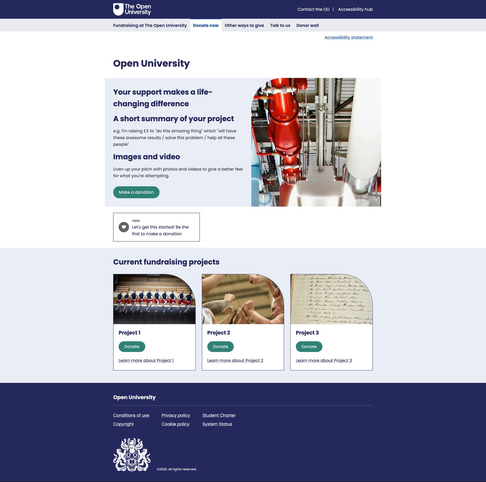
We work from your UI toolkit rather than approximating it. Typefaces, colour tokens, button styles, spacing and component shapes come from your own guidelines, so the result is consistent with everything else you publish rather than close to it.
Your header and footer, your navigation
Including the reduced versions institutions often want on a giving site, where the full global navigation would pull people away from the thing you have asked them to do.
Accessibility to your standard
Not ours. Where your institution runs its own accessibility evaluation, we build to that standard and expect the audit. On the Open University donation site, their accessibility team evaluates the build independently, which is the right way round.
Consistent all the way to payment
The place custom skinning usually breaks is the payment page, where a donor bounces from your branding to the platform vendor’s. The whole journey carries the same design, because that transition is exactly where people leave.
An example
The Open University
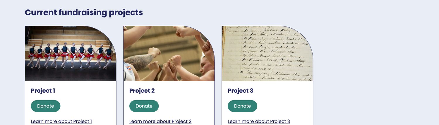
The Open University wanted a donation site that reads as part of the OU web estate rather than as a platform they had bought. We built it to their UI toolkit: their typeface and palette, a reduced version of their global header with the wider navigation stripped out so donors stay focused, a project tile grid shaped to the toolkit, and a simplified footer matching their other sites.
Accessibility was a gate rather than an aspiration. Their own accessibility team evaluates the build independently, to the standard applied across the rest of their estate.

None of that required a separate product. It is the same platform underneath, with a front end built for them.
Across the range
Available on every donor-facing platform
Custom front ends are not limited to one product. Any of these can be built to your design system:
- Causes
- Crowdfunding
- Giving Days
- Challenge Week
- Engagement Platform
- Surveys
- Auctions
Let's talk about your next campaign
A 30-minute conversation with someone who has run campaigns like yours, no hard sell.
Talk to a fundraising expert